Design System
Designing a foundational design system for Treets Admin Console
Overview
Role
Designer
Tools
Figma
Deliverables
Type Scale, Spacing, Colors, Buttons
Timeline
3 Months
COLORS
BUTTONS


SPACING
The Result
This streamlined design system brought immediate improvements to Treet’s admin portal, making it more intuitive and visually cohesive. By starting small, we ensured easy implementation while laying the groundwork for future scalability.
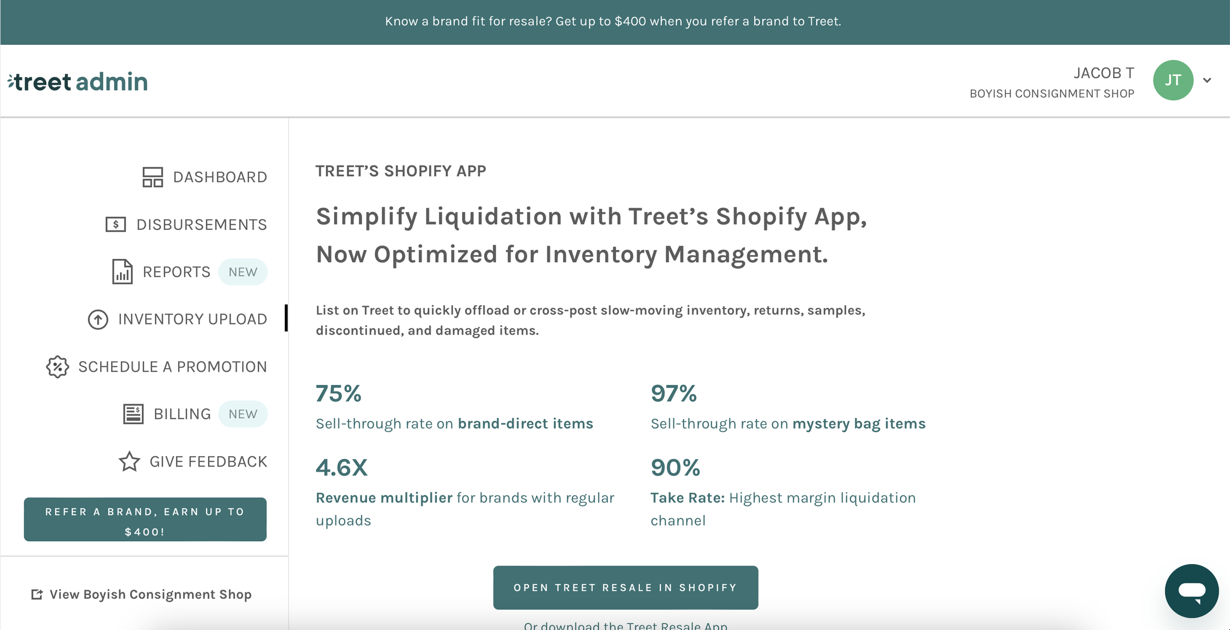
BEFORE
Admin Dashboard - Disbursements

AFTER
Admin Dashboard - Disbursements

BEFORE
Admin Dashboard - Inventory Upload
AFTER
Admin Dashboard - Inventory Upload


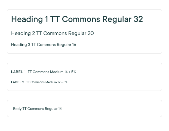
TYPE SCALE
The Challenge
Treet’s main product is a highly customizable site that adapts to different brand identities. While this flexibility benefits customers, it has led to inconsistencies in the admin portal—buttons, typography, and colors lack cohesion. We needed a lightweight, scalable design system to bring clarity and consistency to the admin experience.
Phase 1: Research & Audit
To identify key pain points, our team conducted reviews of various admin consoles, gathering inspiration and best practices.
Phase 2: Building the Foundation
We developed a minimum viable design system that addressed the most pressing inconsistencies:
Typography: Established a clear font hierarchy for titles, paragraphs, and labels based on research into existing design systems.
Buttons: Defined primary and secondary buttons with consistent sizing and states.
Colors: Standardized divider lines and text colors while introducing a new primary action button color, referencing Treet’s Design Guide for brand alignment.
Key Takeaways
Simplicity first: A lean design system made adoption easier.
Research-driven decisions ensured usability and brand alignment.
A strong foundation now allows for future expansion beyond the admin panel.